

How Did 20th-Century Olympic Posters Use Graphic Design to Promote National Identity?
Visual Arts Extended Essay
Word Count: 3979
Introduction
The history of graphic design can be traced back to the first cave paintings produced by prehistoric communities, considered, nowadays, as the first signs of visual composition and creation. Throughout history, humanity has demonstrated a natural appreciation for aesthetics and a special interest in visual expression (Spiro). Graphic design had been considered a subsidiary area and therefore concealed by the field of Art until 1922 when the typographer William Addison Dwiggins first introduced the term in his essay: New Kind of Printing Calls for New Design (Spiro). With its own name, graphic design was, in consequence, established as an independent discipline. The start of the 20th century gave rise to a rapid development of this artistic practice: in advertisements, product packaging, prints, books… suddenly, graphic design was everywhere (Salman). Artists and designers were no longer interested in mere decoration and ornamentation, the ultimate goal was to communicate. It is not good design if it does not communicate, as modern master Paul Rand (Rand and Heller 239) articulated it. The study of typography, colour theory or negative space led to the simplification of graphics, and thus to the effectiveness of communication. This drastic change was greatly encouraged, if not induced, by the Bauhaus movement, whose principle form follows function purely summarised the nature of 20th-century design (Moholy-Nagy 14). Not only did the style and purpose of prints and posters evolve, but technological advancements also led to their mass impression (UCLA Information Studies, Drucker 9). Propaganda and advertisement were more present than ever before, as companies and organisations asked: why not use graphic design for promotion, to express our ideas to the world?
When visual communication became the intermediary between a company and its audience, a new idea emerged—brand identity design (The complete history of branding, Salman). This was not simply about creating a symbol or logo for an organisation, but an entire visual presence. Which involved design elements that were, collectively, recognisable to the audience; and representational of the message and qualities of the advertiser. This raises the question, if graphic design was and is still being used to brand businesses and political groups, can it brand something as large as a country?
The answer is yes. Graphic design has been and is still being used to promote national identity. Representing cultural heritage, an important aspect of humanity, has been personally identifiable information the purpose of various visual campaigns. Some prominent examples are the posters created by countries organising the Olympic games, required not only to announce the games but also assure the international public’s comprehension of the hosting country’s essence.
Consequently, this essay explores the question How did 20th Century Olympic Posters Use Graphic Design To Promote National Identity?
The rationale for this investigation is that a study of messages conveyed by Olympic posters indirectly reveals how groups of people perceive their own cultures and collective (national) identities, as well as how they endeavour in portraying these to the international community. It also offers an interesting view of the evolution of Graphic design, considering its capacity to achieve these two goals simultaneously.
Therefore, the conclusions drawn from this investigation provide concrete examples of the powerful, unique and creative nature of graphic design as a tool for communication.
Methodology
To explore and discuss the research question, this essay analyses three late 20th century Olympia posters: Mexico City 1968, Moscow 1980 and Seoul 1988 (in chronological order). These examples suit the investigation, due to their variety regarding geography, culture and, subsequently, traditional aesthetics or symbols. Contextual information is obtained through secondary sources, specifically, articles about the event and the historical and social background in the host country, not necessarily mentioning the Olympic poster. Furthermore, the use of proper and design-related terminology and in-depth analysis are ensured through physical books on graphic design principles and techniques. The official website of the Olympiads is used and cited for the inclusion of accurate names or facts. Finally, digital copies of the Olympic committee reports (for each year) are employed as primary sources of information regarding the intention of the visual campaign, design process or public response.
Analysis
The Role and Value of the Olympic Poster
Since the start of the modern Olympiads back in 1896, the promotional programme of the games has been crucial to attract visitors and ensure international engagement. Providing the public with information, including dates and locations, through prints was an essential element of the Olympic campaign, especially in a world without technology or digital media. Even though the first modern games heavily relied on posters for public communication, it was not until the early 20th century that the concept of the official Olympic Games poster was generated (The Olympic Museum 4). The Stockholm Games of 1912 were a milestone in the history of the Olympics, not predominantly for the sport competition or achieved results, but rather for the official emergence and the importance attributed to Olympic poster design (Timmers 19). This practice would, from that point on, become a tradition and an indispensable element within the organisation of the Games.
The role of the Olympic Poster is not only to promote the event itself, but to also encourage and generate the audience’s excitement. The simultaneity of these messages complicates the design task for graphic designers, particularly considering that the intended audience is the global community—multinational, multilingual and therefore multicultural. The hosting country is required to present itself to both a domestic and foreign audience, in a way that favourably influences the public perception of the country, represents its cultural heritage and aligns with the values of Olympism (International Olympic Committee). Consequently, from a political and social perspective, the task of hosting and creating the visual identity of the games is, and has been the perfect opportunity for nations to influence at an international level. In other words, the hosting country could, for once and because of the Olympiads, express desired messages, cultural values or an overall image, anticipating the world’s attention (Timmers 7).
It is significant to highlight that these posters do not only have to travel geographically, but also temporally. Successful campaigns have remained relevant within the contemporary international context, and still recognisable by future generations. Each official poster remains a symbol of that specific edition—a visual legacy which can be perceived as a fascinating record of the development of graphic design and our time (Olympics).
The Olympic Emblem
 The Olympic emblem was created by the founder of the Olympic movement, Pierre de Coubertin, and first publicly introduced in 1913 (Lany). Its design consists of five interlaced rings, each of a different colour (See Fig 1). The literal message of the symbol is to embody Olympism—therefore, to indicate a direct connection to the Olympic Games. On the other hand, the figurative sense or more abstract perception, is that each of the rings represents one continent (See Fig 2) (Woodin). Furthermore, by combining the colours, the flags of all participating nations can be constructed.
  As a result, considering these two interpretations, the symbol signifies the unification of all continents and nations into a single sporting event—which aligns with the moral goal of the Olympiads: to contribute to building a peaceful and better world by educating youth through sport practised without discrimination of any kind and in the Olympic spirit, which requires mutual understanding with a spirit of friendship, solidarity and fair play (International Olympic Committee).
The Selection of the Olympic Poster
Due to the significant role of the Olympic poster, as discussed above, its selection was a sophisticated and often lengthy process, which involved a wide group of artists and designers, as well as the Organising Olympic committee (Olympics).  Traditionally, it was common for the committee to arrange a national poster contest and select one piece which would be considered the official poster. However, as poster design itself, this process developed through time. Starting from the 1960s onwards, hosting countries could select various official posters or have different sorts of posters (cultural posters, sport-specific posters, etc.), open the contest to foreign artists, set up public design exhibitions before the games to gain feedback, etc. (Timmers 9) (See Fig 3). After the selection of the primary poster, its visual features were usually implemented to design secondary graphics: tickets, information pamphlets, iconography, signs, etc. (Olympics) and therefore, create an entire, cohesive visual identity that would become a brand for that specific event—in other words, the look of the Games (Osterwalder).

Historical context
As early as 1963, when the International Olympic Committee (IOC) selected Mexico as the venue for the upcoming 1968 Olympiads, the post-revolutionary Latin American country lacked foreign reliance on their ability to undertake the organisation process (Brewster 102). Not only did other nations perceive the country as unprepared, but also the majority of the national population saw the Games as an unnecessary expenditure (Blundell 197).  As a result, tension built up between those Mexicans that sought to get transnational recognition through the event, and those, predominantly members of the lower classes, who saw the country’s involvement in international affairs as a waste of time and money (Brewster, Timmers 77). Domestic dissent over the Games was one of the factors leading to the Student Riots of 1968, just days before the opening ceremony (Mexico’s 1968 Massacre, Britannica School) (See Fig 5). Moreover, the contemporary political and social issues, including the Vietnam War, the Cold War or the countless civil protests across the globe, developed an international background that could further obstruct a successful and tranquil celebration of the competition (Blundell 198).
Aims of the Campaign Unwilling to cancel or hand over the hosting of the Games, the Mexican Olympic Committee acknowledged this hostile environment when creating a campaign that prioritised the symbolic elements of the Games over the sporting contest (Brewster 99). Peace and international harmony were the intangible ideas that, along with the expression of a true Mexican identity, would establish a platform for all nations to come together. Concerning the country’s public profile, Vázquez aimed to overcome the lazy and backward stereotype and present Mexico as a nation proud of its pre-Hispanic origins, yet advanced, evolved and deserving the world’s recognition and respect (Brewster 102, 103). Therefore, designer Markus Osterwalder’s words: You need to know the past if you want to design the future, capture the committee’s approach to the graphic campaign (Olympics, Osterwalder).
Visual techniques
Designer Lance Wyman’s simple idea to overlap the Olympic rings with the number 68 was the first step towards Mexico’s iconic visual identity programme (Timmers 78).  The development of the typographic style and addition of Mexico contributed into a finalised logotype which integrated the location, date and Olympic rings (Mexico ’68 Olympic News, Olympics). Containing all essential information, the logotype itself evolved into the official poster (See Fig 6), the central visual of the whole campaign.
The use of repeated lines stemming from the text towards the edges canvas of the text created a dynamic effect of limitless energy (See Fig 6), relating to sport and physical activity. The pattern resembled contemporary American Op Art (Olympic Design, Wooldrage) (See Fig 7), and thus gave the poster a notably modern look. Still, Mexico’s traditional facet was incorporated through inspiration from national folk art (Organising Committee XIX Olympiad 102). The use of line, as Wyman remarked, was influenced by traditional Huichol patterns (See Fig 7) (Olympic Design, Byrne). 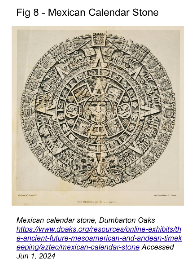 Furthermore, the balanced composition, with the logotype marking the origin and lines radiating outwards, resembled pre-Hispanic calendars (See Fig 8) (Cartwright et al.). This synthesis of a heritage-rich and an advanced Mexico, was also conveyed through the minimalist, yet elaborated typography. In essence, the three lines composing each character contributed to the campaign’s energetic feeling. Alternatively, from a more abstract viewpoint, these embodied the lanes in a running field or the individual countries flowing in unison by participating together in a single competition.
Despite lacking in the official poster, colour played a fundamental role in the campaign. Secondary posters were rich in colour and symbology (See Fig 9-13). The placement of the Mexico68 logo in white, contrasting with the background, further enhanced uniformity across the diverse pieces. Additionally, they alluded to the Olympic rings by containing circular shapes with the respective colours, or simply these implemented to other designs (See Fig 10). The viewer was invited to appreciate vibrant Mexican culture, which appeared cohesively linked to the competition. Lastly, in terms of symbols, tourism posters were highly wide-ranging. For instance, images of flowers, textiles, trees or birds covered the canvas, often overlapping with the logo in a congruent manner.  Consequently, references were made to various cultural aspects: traditional flower embroidery, weaving and the importance of birds to Otomi Indians (Lewis 21-22, The Olympic Design). Moreover, the sport-specific posters, displaying human figures (See Fig 12-13), resembled lithographic pieces, a characteristic Mexican art tradition (McDonald). In light of everything, the design of the campaign was a clear attempt to overcome the cliché of the Mexican sombrero and the cactus, which had dominated the foreign perspective, and to proudly display that Mexico’s culture had more to offer (Timmers 78, Brewster 109, Byrne).
National and International Impact
The 1968 campaign succeeded in resonating through the history of the Olympics, and thus setting a high standard to all preceding Olympic Games (Wooldrage, Timmers 78). The cohesiveness among the visual elements to form meaning, as well as the development of a unique and recognisable typeface, demonstrated the design team’s profound comprehension of a brand. Almost 60 years later, the logotype remains present within the art and fashion scene (See Fig 15) (Mexico: ’68 Olympic News). In the most recent Olympics, Paris 2024, Team Mexico’s athletic wear exhibited the 1968 graphics (See Fig 16) (Borja), proving the status of the campaign as a national icon. In conclusion, the creation of a graphically presented national identity, allowed Mexico to unveil its culture to visitors, especially to close-minded individuals that deceived themselves by holding simplistic stereotypes. Consequently, it demonstrated design’s power to capture and display complex concepts, such as the coexistence of heritage and progress to a heterogeneous audience, and thus communicating a national façade influencing international perception.

Moscow 1980 Olympics
Historical context
The Cold War, with still 11 years ahead, was at its highest peak in the late 1970s, threatening international peace. Tensions between West and East, the two sides of the Iron curtain, produced an infeasible ambience for an event that revolved around international cooperation (Timmers 97). As bad as these dynamics were, they further worsened after December 1979, when, just months before the opening ceremony, the USSR invaded Afghanistan causing devastation (Edelman 151). The immediate consequence of this violent policy was the discontent of the international scene and, subsequently, the boycott of the Games. 61 nations, including the US, West Germany and Japan, refused to attend the competition (Blundell 199, Timmers 98).
Aims of the Campaign
Regardless of the questionable decisions made by Soviet authority, the Olympic campaign designed by the Soviet Committee did, at least formally, align with the values of Olympism. As indicated by the official reports, the intentions were to promote the Soviet Union as a modern multinational state, and thus, as comparable to the world itself (Edelman 157). Furthermore, the expression of national pride, strength and grandiosity of sport, suited the concrete essence of the Games: competition. Another approach to the campaign was to put emphasis on the idea of human progress. Through these aspects the Soviets desired to demonstrate a relationship between the apparently incompatible Communism and Olympism (Edelman 154), and therefore motivate other countries to abandon past conflicts and attend the event in the spirit of advancement and modernity.
Visual techniques
The campaign design was inspired by Soviet political publicity, to the extent that most graphics display a strong resemblance to propaganda posters (See Fig 23). The emblem, created by Vladimir Arsentyev, is composed of 3 elements: the Olympic rings at the bottom, parallel lines echoing typical Soviet architecture (See Fig 24) and the Soviet star at the top (Novikov 354).  Alternatively, the lines, emerging from the sides, turning and extending upwards might simulate an athletic track, and the star, reached by the centre line, a symbol for achievement and success (Timmers 99). The official poster is made up of the emblem (See Fig 18). The colour red, filling the background and recurring in all secondary posters (See Fig 19-20), directly references the Communist movement. In light of colour psychology, the shade of bright red in the primary poster, as well as the prominent use of warmer colours across the pieces, evokes an aura of power and intensity. In addition, the presence of yellow and gold incorporates a sense of excellence, success and achievement in relation to sport, as well as, the host itself. The colours of the Olympic rings are also featured, either through the Olympic symbol directly (See Fig 20 and 22) or within other shapes (See Fig 19 and 21).

The composition, balanced and with the focal point established in the middle of the canvas adds to the glorious and grandiose depiction of the Olympics by giving protagonism to symbols such as the Olympic torch or flag (Timmers 99). As in Socialist propaganda, the use of symbolism is direct and literal, offering little opportunity for abstract interpretations or  misunderstanding. Shapes are detailed and closely realistic, evoking solidness and tradition rather than graphic innovation. Another feature which resembles Communist propaganda is the use of exaggerated proportions. Moscow, with its characteristic buildings (See Fig 24) crowned by Soviet stars, is exhibited in the background from a distant, bird’s-eye view with a blurred horizon enhancing the sense of immensity (See Fig 19 and 22). In the foreground, a disproportionately large torch or flag rises upwards, as Stalin’s figure in typical propaganda posters (See Fig 23).
  Consequently, the Olympic poster’s design embodies an authentic and recognisable Soviet spirit.
Text complements these symbols through a campaign slogan: Sport, Peace, Friendship (See Fig 20). In this specific example, the text, in Russian, English and French, creates the outline of the torch itself, and thus contemplates these three principles as the basic components of Olympism. The typeface, Futura Medium, remains consistent across most of the graphic work, keeping a clean and uniform aesthetic. The fusion of determined graphic features and Olympic symbolism, allowed the translation of pure Soviet nation publicity into an Olympic campaign directed to a much wider audience.
National and International Impact The design of the campaign stayed, conceptually and graphically, loyal to Soviet and, in many aspects, Olympic principles (Edelman). Despite being unpopular across the international sphere, the Soviet Union successfully presented its national essence, or at least, an idealised and positive version of it. This however, was not reason enough to attract or convince ideologically rival countries to join the competition, who chose to ignore any appeal for peace in the campaign, and sabotage the event (Timmers 98). In terms of design legacy, the Soviet graphics did not remain notable due to its lack of originality. In other words, they did serve the purpose of conveying national spirit at the time, but not to stay in people’s minds. It must be noted, however, that the negative connotations the former regime had and still has in the Western world might have facilitated the international dismissal of this specific edition of the Games. Consequently, Moscow 1980 proved how graphic design can be used to present a country in the best light possible, but yet, a lack of innovation or external factors might make it insufficient to stimulate international cooperation or receive appreciation across time.
Seoul 1988 Olympics
Historical Context
Still suffering from the repercussions of World War II, the Japanese occupation and the most recent Korean War, South Korea struggled financially and politically in the 1980s. Additionally, the major repercussion of this period of military conflict had been the enduring division between North and South Korea, remaining intact today. Their Northern neighbours were ideologically opposite, having adopted the Soviet system while South Koreans shifted towards a democratic and capitalist form of government. The IOC, after a period of boycotts, political turmoil and failure regarding participation from both East and West nations, saw in Korea the opportunity to revive the true Olympic spirit (Cho 99, 106). The initial plan was for North Korea to co-host the event. In that way, communist countries would feel motivated to attend, regardless of South Korea’s Western way of life. The negotiations were a disaster, and North Korea rejected the offer of sharing the Olympics to then conspire against its preparations (Cho 116).
Aims of the Campaign
Within such a dichotomic setting, South Korea could only focus on portraying itself in the most welcoming way possible, and attract both East and West countries simultaneously. The campaign was designed to introduce South Korean culture and its traditions, and to revolve around the Heaven-Earth-Man philosophy (Cho 119). The ethos of the campaign was: progress and harmony (Timmers 110), which were the steps, as the graphics displayed, to a greater peace. Furthermore, noting the positive effects of the 1964 Olympiads for the host, Japan, South Korea recognised the upcoming Games as a chance to overcome their geographical isolation, modernise and develop economically, whilst improving their significance in the international sphere. For the campaign designers, this meant that they had to expose national identity in an internationally accessible and festive way.
Visual techniques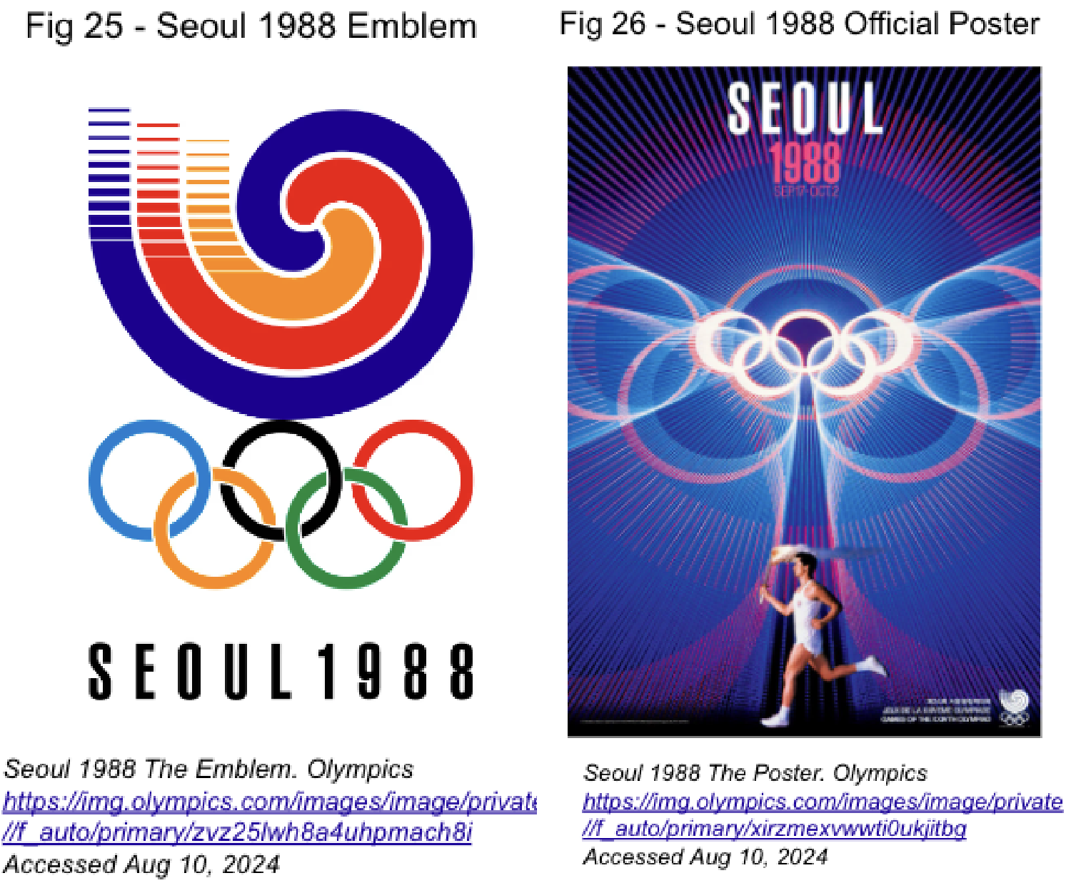 Inspired by traditional Korean culture, the graphic campaign for the Olympiad was abundant in figurative meaning and symbols.
The emblem, designed by Yang Sung-Chun (See Fig 25) was a depiction of a sam taegeuk, a traditional Korean pattern used as a decorative element (See Fig 27) or in folk art (The Olympic Design, Timmers 108). Physically, it exhibited a spiral made up of 3 single lines joining at the centre, however, figuratively it represented two forces: a centripetal and a centrifugal force. These were meant to symbolise individuals meeting for the Olympics, and the path of man in search of lasting happiness and prosperity, respectively (Seoul Olympic Organising Committee 633).  The Olympic rings, touching the pattern at the bottom, sustain this energy process. Such was the importance of Olympism in the campaign, that the Olympic emblem was given all protagonism in the official poster (See Fig 26). The placement of the rings, slightly over the centre point and in between the text and the human figure at the bottom of the canvas, created a vertically symmetrical composition. Yet, the outward radiating lines from the rings creates an interesting dynamism and three-dimensional visual effect. The lines in blue and dark orange stretched across the whole poster in circular motion, and seemed to shift the emblem out of the poster and closer towards the viewer. Below, the human figure, symbolising human progress, was illuminated and nourished by this source of energy, Olympism (The Olympic Design).
 The secondary posters, created for cultural purposes, took the dynamism further. Each of the cultural posters, 17 in total, exhibited a particular Korean custom in a minimalistic aesthetic (See Fig 28-30). The simplification of the shapes, featuring prominent spirals and curves, provided a modern look, while preserving the traditional subject matter. The extensive colour palette, dominated by bright colours, added vibrancy and even playfulness to the campaign, further intensified by the stylised characters. These, including the official mascot Hodori (See Fig 31) were perceived as comic and benign to the audience. Finally, the pieces were joined together through a common gold or silver stripe at the bottom, showing the relation of the poster with the excellence of the Games.
National and International Impact
What made these Olympiads particularly remarkable was the success in uniting eastern and western countries in a sporting event once again. Most communist countries, including the USSR, and excluding North Korea, attended the competition, despite consciously facing their enemies in the playing field. Furthermore, the campaign was highly effective in depicting the country’s culture, as reflected by the smooth unfolding of the event, the resulting increment in South Korea’s economy and tourism, and improved international relations with both East and West (Cho). For Koreans the 1988 Olympics marked a turning point in their international standing: from a recently divided, impoverished country in Asia, to a modern, promising nation, with the advocacy for peace and harmony.
Conclusion
Since its establishment, the artistic discipline of graphic design has allowed society to experiment with image, colour or text with the purpose of mass communication. Nowadays, its applications vary from the food packaging to the websites we visit every day. The promotion of products, services or political ideas through graphics has existed for a long time, growing even more prominent after technological advancements. Due to the current typicality of these applications, this essay has chosen to overlook them and focus on the promotion of a larger, more abstract concept: national identity. Posters from the Olympics have been adequate to answer this question and thus uncover the possibilities and ways in which graphic design can capture a national essence, a sentiment… concepts that go beyond written or verbal descriptions. Due to the cultural and temporal variety of the chosen visuals for analysis, various answers have been obtained, yet sharing the following similarities. 20th century Olympic posters have demonstrated the ability to display a multifaceted view of a single nation, often uniting past, present and future through cultural references or artistic styles. With the help of these graphics, audiences from different backgrounds have been able to sense and understand a country’s culture whilst observing the competition. For each hosting country, the creation of the campaign has permitted collective reflection on self-identity, and the presentation of a vision that reflects: this is who we are.
Works Cited
Blundell, Nigel. The history of the Olympics. London, Parkgate, 1999.
Borja, Luz. Quién es el dueño de la marca que viste a los mexicanos en los Juegos Olímpicos 2024. Informador, 26 July 2024, https://www.informador.mx/deportes/Quien-es-el-dueno-de-la-marca-que-viste-a-los-mexicanos-en-los-Juegos-Olímpicos-2024-20240726-0081.html. Accessed 10 August 2024.
Brewster, Claire, and Keith Brewster. Mexico City 1968. National Identity and Global Sports Events, State University of New York, 2006, pp. 99-116.
Britannica School. Mexico. Encyclopædia Britannica, 19 April 2024, school.eb.co.uk/levels/advanced/article/Mexico/108719. Accessed 10 July 2024.
Britannica School. Moscow 1980 Olympic Games. Encyclopædia Britannica, 19 April 2024, school.eb.co.uk/levels/advanced/article/Moscow-1980-Olympic-Games/98213. Accessed 10 July 2024.
Byrne, Emmet. Radiant Discord: Lance Wyman on the ’68 Olympic Design and the Tlatelolco Massacre. Walker Art Center, 20 March 2014, https://walkerart.org/magazine/lance-wyman-mexico-68-olympics-tlatelolco-massacre. Accessed 17 August 2024.
Cartwright, Mark, et al. Sun Stone. World History Encyclopedia, 4 September 2013, https://www.worldhistory.org/Sun_Stone/. Accessed 17 July 2024.
Cashman, Prof. Richard. History of the Olympics: 1980. 25 May 2024. ABC Radio Sydney, https://www.abc.net.au/listen/programs/nightlife/moscow-olympics-1980/103893770. Accessed 20 July 2024. Podcast Episode.
Cho, Ji Hyun. The Seoul Olympic Games and Korean society: causes, context and consequences. Loughborough University Institutional Repository, 2009, p. 309. Core, https://core.ac.uk/download/pdf/40036933.pdf. Accessed 14 August 2024.
The complete history of branding (and what it can teach us). VistaPrint, 28 February 2020, https://www.vistaprint.com/hub/history-of-branding#section5. Accessed 5 June 2024.
Edelman, Robert. Moscow 1980. National Identity and Global Sports Events, State University of New York, pp. 149-159.
Gage, John. Color and Culture. Practice and Meaning from Antiquity to Abstraction. Thames & Hudson, 1993.
Gomez Palacio, Bryony, and Armin Vit. Graphic Design, Referenced: A Visual Guide to the Language, Applications, and History of Graphic Design. Rockport Publishers, 2012.
International Olympic Committee. Beyond the Games - promoting sport and the Olympic values in society. Olympics, https://olympics.com/ioc/beyond-the-games. Accessed 1 June 2024.
Lany, Olga. The Legacy of the Olympic Rings - Admind. Admind agency, 26 June 2024, https://admindagency.com/blog/the-legacy-of-the-olympic-rings/. Accessed 24 August 2024.
Lewis, Elizabeth. World Art and Culture: Mexican. Oxford, Harcourt Education, 2003.
McDonald, Mark. Printmaking in Mexico, 1900–1950 | Essay. The Metropolitan Museum of Art, https://www.metmuseum.org/toah/hd/prmx/hd_prmx.htm. Accessed 24 June 2024.
Mexico ’68: the look that captivates crowds to this day - Olympic News. Paris 2024, 29 October 2018, https://olympics.com/en/news/mexico-68-the-look-that-captivates-crowds-to-this-day. Accessed 17 August 2024.
Mexico’s 1968 Massacre: What Really Happened? NPR, 1 December 2008, https://www.npr.org/2008/12/01/97546687/mexicos-1968-massacre-what-really-happened. Accessed 12 August 2024.
Moholy-Nagy, László. Objectives and Methods of Bauhaus education. New Vision: Fundamentals of Bauhaus Design, Painting, Sculpture and Architecture, Dover Publications, 2005, pp. 13-15. Google Books, https://www.google.de/books/edition/The_New_Vision/Wn3CAgAAQBAJ?hl=en&gbpv=1&pg=PA1&printsec=frontcover. Accessed 1 June 2024.
Novikov, I. T., editor. Games of the XXII Olympiad: Official Report of the Organising Committee of the Games of the XXII Olympiad, Moscow, 1980. vol. 1, Moscow, Organising Committee of the Games of the XXII Olympiads, 1981. 3 vols. The Olympic Studies Centre, https://library.olympics.com/Default/doc/SYRACUSE/46841/games-of-the-xxii-olympiad-official-report-of-the-organising-committee-of-the-games-of-the-xxii-olymp. Accessed 16 April 2024.
The Olympic Museum Educational and Cultural Services. Olympic Games Posters. Edited by Lausanne Oxyde. The Olympic Museum, vol. 1, no. 1, 2013, p. 16. The Olympic Museum. Accessed 11 May 2024.
Olympics. Design Focus Look of the Game. 2018. Youtube, https://www.youtube.com/watch?v=-0Avu_a6drE&list=PL-292yfpAFGaQXmZmo_7hqnY5jF8gzphS&index=10. Accessed 1 June 2024.
Organising Committee of the Games of the XIX Olympiad. Mexico 68 / Comité Organisateur des Jeux de la XIX Olympiade. vol. 2, Mexico City, Organising Committee of the Games of the XIX Olympiad, 1969. 5 vols. The Olympic Studies Centre, https://library.olympics.com/Default/doc/SYRACUSE/53580/mexico-68-comite-organisateur-des-jeux-de-la-xix-olympiade. Accessed 10 April 2024.
Osterwalder, Markus. The Look of the Games. Olympic Games – The Design, https://www.theolympicdesign.com/olympic-games/the-look-of-the-games/. Accessed 2 June 2024.
Rand, Paul, and Stephen Heller. Paul Rand: A designer’s art. Illustrated Edition ed., Princeton Architectural Press, 2016.
Salman, Maryam. The Role of Graphic Design in 20th-Century Advertising and Pop Culture. Medium, 24 October 2023, https://medium.com/@maryam.salman70/the-role-of-graphic-design-in-20th-century-advertising-and-pop-culture-1ffab58aecdc. Accessed 10 May 2024.
Seoul Olympic Organising Committee. Games of the XXIVth Olympiad Seoul 1988 Official Report Organisation and Planning. vol. 1, Seoul Olympic Organising Committee, 1989. 3 vols. Amateur Athletic Foundation of Los Angeles, https://digital.la84.org/digital/collection/p17103coll8/id/33446/. Accessed 20 July 2024.
Spiro, Samantha. The History of Graphic Design. Linearity, 24 May 2022, https://www.linearity.io/blog/history-of-graphic-design/. Accessed 25 April 2024.
Timmers, Margaret. A Century of Olympic Posters. Paperback ed., South Kensington, London, V&M Publishing, 2008.
UCLA Information Studies Department, and Johanna Drucker. Chapter 9. Industrialization of Print. History of the Book, vol. 1, no. 1, 2018. History of the Book, https://hob.gseis.ucla.edu/HoBCoursebook_Introduction.html. Accessed 2 June 2024.
Woodin, Andrew. The Meaning of the Olympic Rings. NBC, 11 April 2024, https://www.nbc.com/nbc-insider/meaning-behind-olympic-rings-5-colors-symbolism-flag. Accessed 20 June 2024.
Wooldrage, Chloe. Mexico Olympics 1968. The choice of Mexico to hold the… | by Chloe Wooldrage | FGD1 The Archive. Medium, 17 October 2017, https://medium.com/fgd1-the-archive/mexico-olympics-1968-32fc8d7e0e45. Accessed 17 July 2024.